Overview
Zomato is a global restaurant finder app that has taken over what used to be UrbanSpoon. The company’s mission is to “ensure nobody has a bad meal.” Growing up in San Francisco, it comes as no surprise that I am a big foodie who enjoys finding new restaurants to try. Despite the app having millions of downloads, I had never heard of Zomato before. I set out to discover why Zomato has not seen the popularity of other restaurant finder apps, such as Yelp, and to explore feature enhancements to improve the restaurant finding experience.
Usability Testing
Developing a Persona
Before testing the app, I started by developing a persona to guide me in the early stages of the process and develop need statements. This persona informed the tasks I created to test the app as well as assisted me in the redesign process.
Guerrilla Usability Testing
Before conducting the tests, I took note of some UI issues that I found to be cumbersome or poorly designed. I then created tasks that involved interacting with these UI elements and devised some scenarios in which a user would have to perform those tasks:
1. Imagine that you want to find a highly rated restaurant in the area. How would you go about doing that?
2. Imagine that you want to explore the Mission's food options but are craving Thai food. How would you go about finding a Thai restaurant in the Mission?
I performed the guerrilla usability tests with 7 participants. None had previously heard of Zomato but all had used similar restaurant finders before. With their consent, I recorded their finger movements in relation to the app and encouraged them to narrate their thought process out loud.
Testing Results
After analyzing the recordings and documenting the thoughts and actions of the testers, I noticed 3 main pain points:
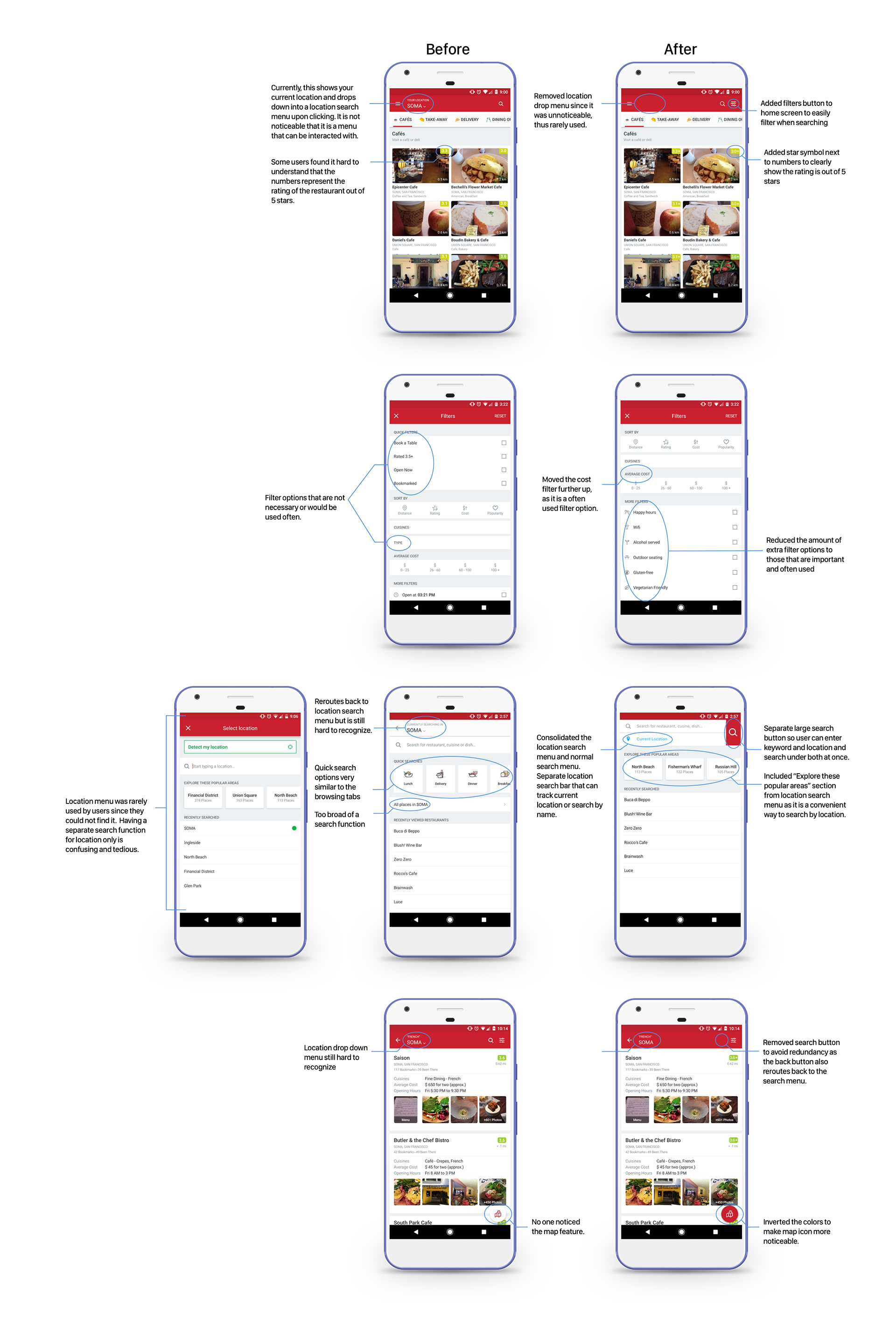
1. Users would try to search by location by typing in the search bar instead of using the location menu; location menu was unnoticeable.
2. Users could not find filters to sort by rating
3. There is a lot of redundancy in the searching with multiple ways of doing the same thing.
Other observations
1. Some users did not understand the rating system
2. There were too many search options that the users said they would not use
3. Users would search by typing in keywords of choice and location
Analysis and Redesign
Task Flow
To fully understand how to address the different pain points I had discovered, I made a task flow of the app.
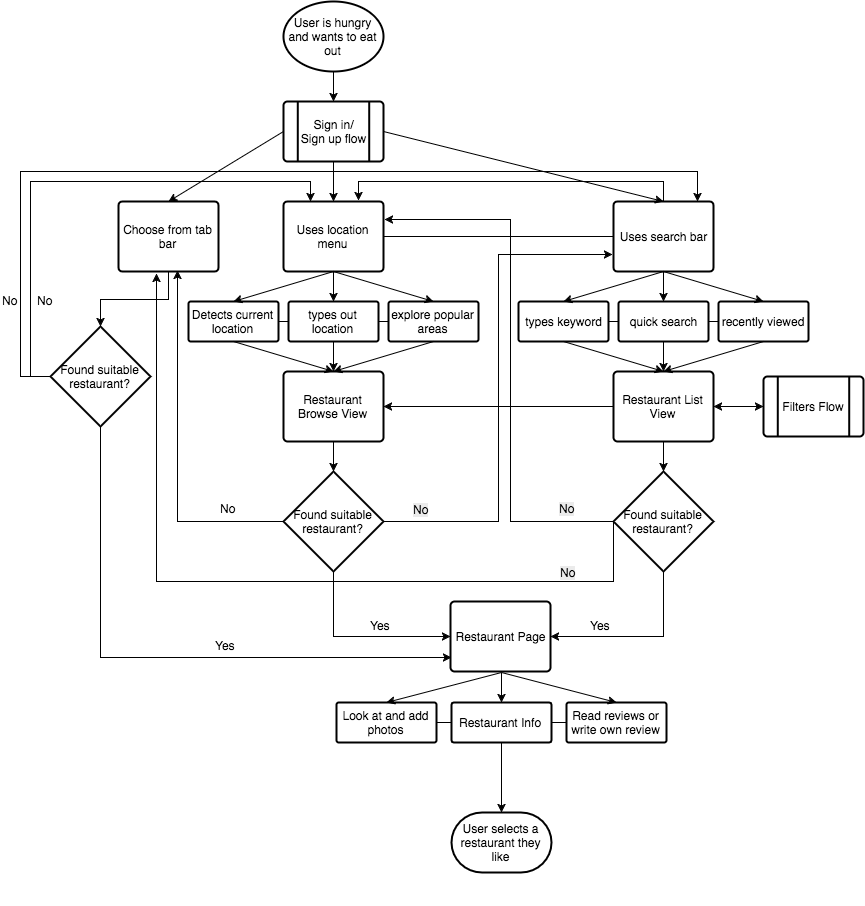
The task flow was fairly complex because there are so many different methods to search for a restaurant and they connect back to each other, making the process very confusing. Learning this helped me narrow down how I would redesign the app.
Based on the research findings, I prioritized 2 main objectives:
1. Streamline the search process to make it quick and easy to search for a restaurant.
2. Make it easy to filter searches
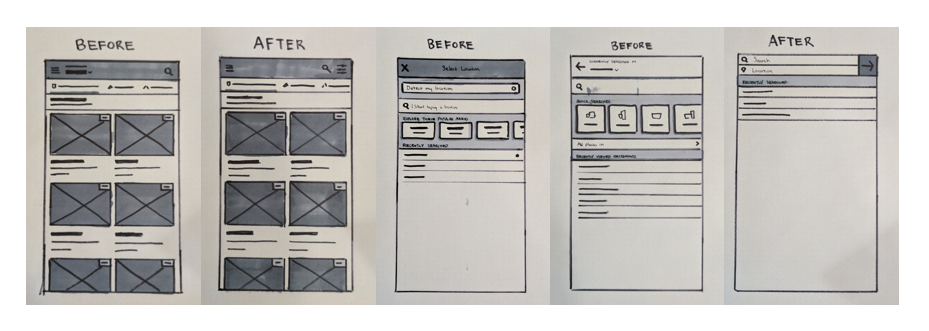
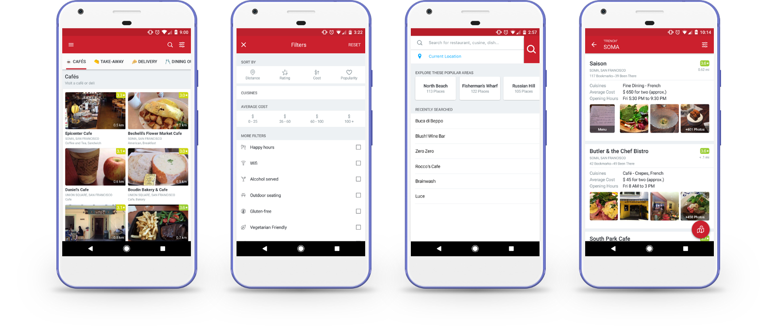
UI Sketches
After synthesizing the key pain points and problems I wanted to address, I began the process of sketching out possible redesigns to improve the UI of the application. The four main screens I wanted to address were the home page and its navigation, the filters page, the search menu, and the search results page.
Design Decisions
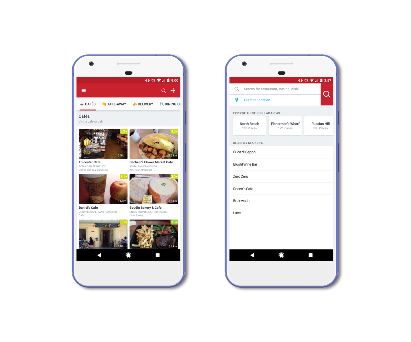
After sketching out my designs, I moved over to Sketch to create my mockups of the screens I decided to redesign. Here are the final designs for the Home page, filters page, search menu, and the search results page. The filters page and search menu were the major redesigns with the Home page and search results page containing UI fixes that addressed minor issues brought up during the usability testing.
Comparison
Disclaimer:
This is an unsolicited design case study. I am not affiliated with Zomato in any way.