Project Overview
GreyWire is an early stage startup that is in the process of developing an idea management platform to increase innovation in corporate companies. By providing an integrated and easy to use application, they intend to facilitate company innovation through participation of employee generated ideas. Their mission is to help companies innovate by tapping into the ideas of their employees and to provide employees with a place to voice and discuss these ideas. I worked with five other researchers and designers to develop this product.
MY ROLE
I conducted user interviews, usability testing, and designed screens throughout the Lo-Fi and Hi-Fi stages for desktop, tablet and mobile sizes.
THE CHALLENGE
Design an MVP for a responsive web application that drives high user engagement
TIMELINE
10 weeks
Research
INDUSTRY RESEARCH
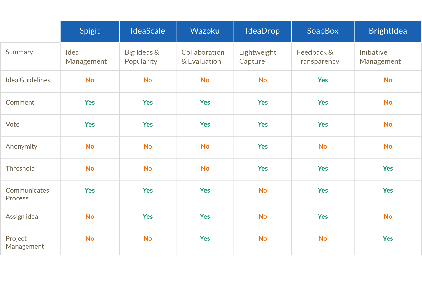
Before thinking about the design of the app, we started by exploring other similar products and their value propositions. We wanted to gain a clear understanding of what problem they were trying to solve and how they addressed the problem through their design choices. Through our research, we came upon six similar idea management software:

We analyzed product marketing sites, reviews, and videos to compare the different features each product offered. We took into account each feature and its use case so we could decide if they fit GreyWire's value proposition and if they should be included during the design phase.
USABILITY TESTING
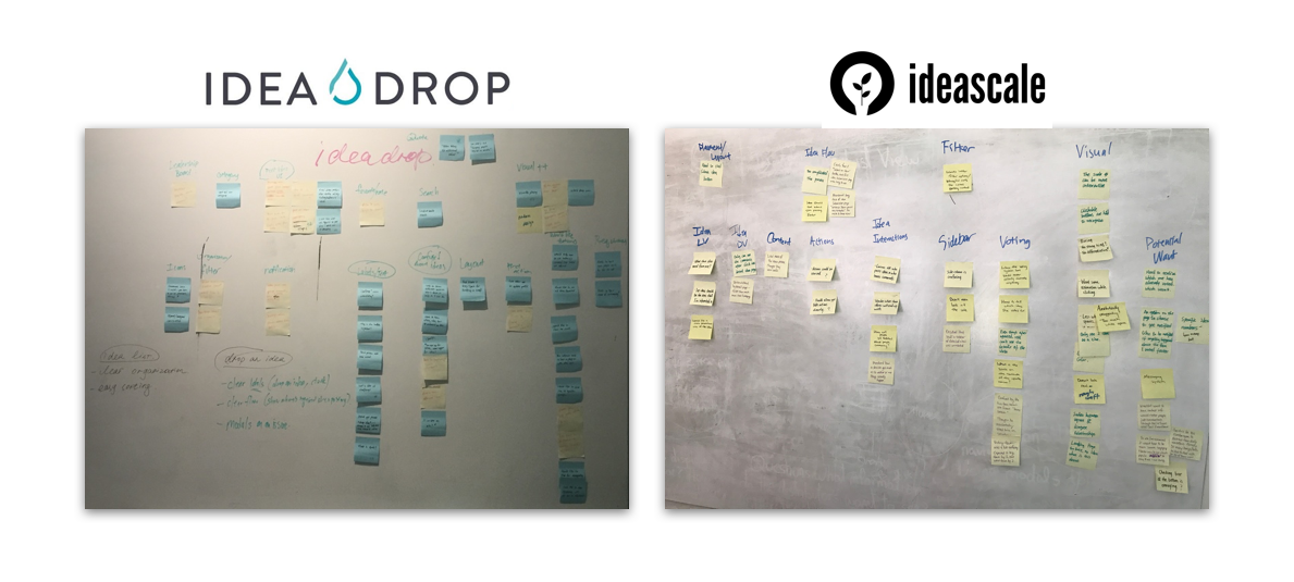
We were able to get access to demos of two of the competitor products. Since GreyWire did not have a physical product yet, we decided to conduct initial usability testing on these products. Our goals for these tests were to:
• understand a first time user's comprehension of the application
• understand their mental models in regards to idea generation and participating in ideas
• track common user behaviors
• uncover pain points
We conducted 12 usability tests in total (6 for Idea Drop and 6 for Ideascale). We asked our subjects to perform a series of tasks within the application and had them narrate their thought process, We then consolidated all of our notes and took note of common insights and pain points.
From our usability testing sessions, we found these to be common themes the subjects cared about:
• Ideas displayed need to be clearly organized and have relevant filter options
• Idea submission guidelines should be established and easy to find
• Established flows on what happens after the user submits an idea should be made clear
• UI needs to be engaging and fun but not sacrifice clarity
• Clearly represent voting data
• Layout should be optimized for seamless browsing
We recorded these results to be used during the prototyping phase for what we should and should not include.
USER INTERVIEWS
After getting a better understanding of the innovation software space and knowing what features to consider, we needed to learn more about our possible users. The founders gave us our targeted demographic and we were able to reach out to 7 people in our network to do user interviews. Our goal was to understand the behaviors, needs, goals, motivations, and frustrations of corporate employees. Using a script, we each interviewed an employee in a corporate company and took notes of their responses. We also recorded the interview to look back on if needed.
We then collected pain points and insights the interviewees had around innovation in their workplace and how GreyWire could be of use. We reconvened and displayed all the notes we took and discussed their importance and how we could use these findings in the development of GreyWire.
These were the main insights we collected:

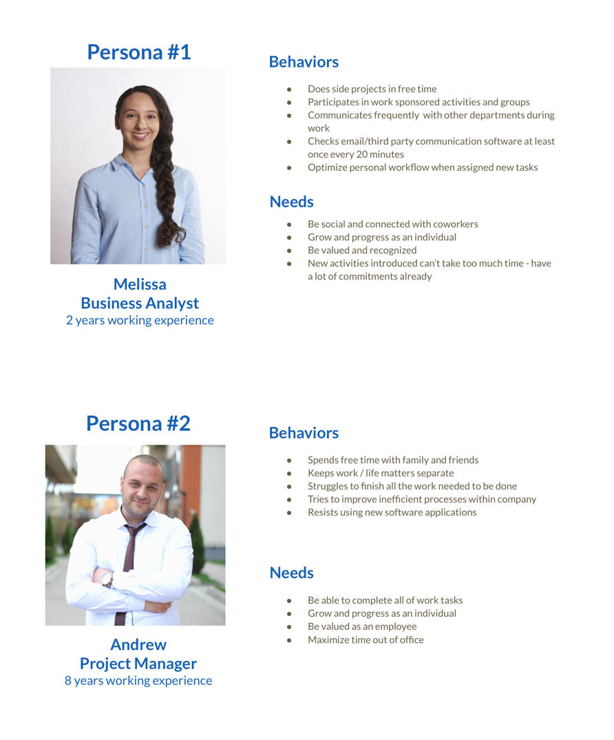
USER PERSONAS
Based on our user interviews, we found that there were two types of users so we created two provisional personas that would serve to help with our team's future design decisions. We recognized that 7 people was a very small sample size but we had limited resources and had to make do. We presented these personas to the founders and they made the executive decision to focus on designing for Persona #1, but without alienating Persona #2.
Lo-Fi Prototyping
SKETCHES
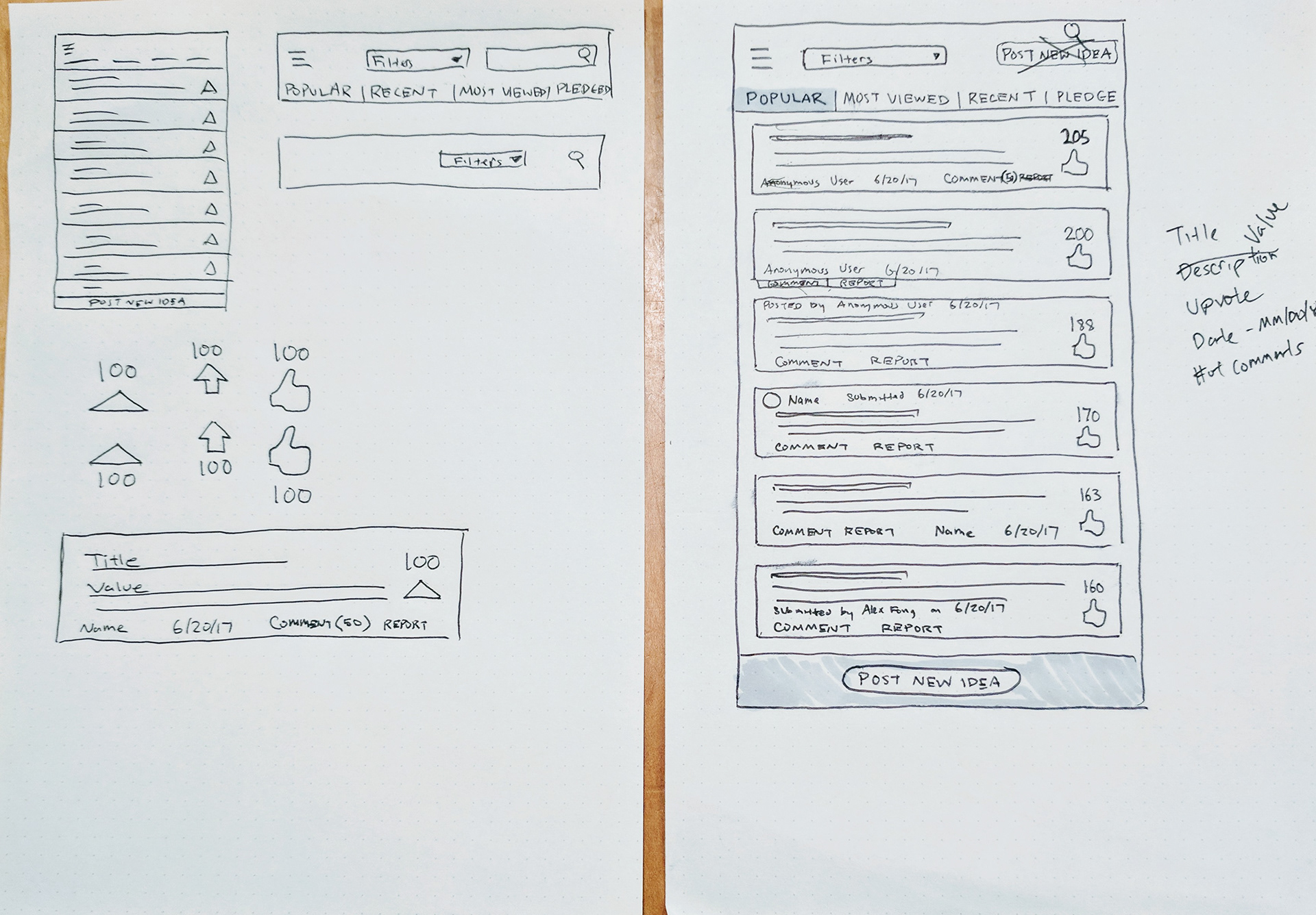
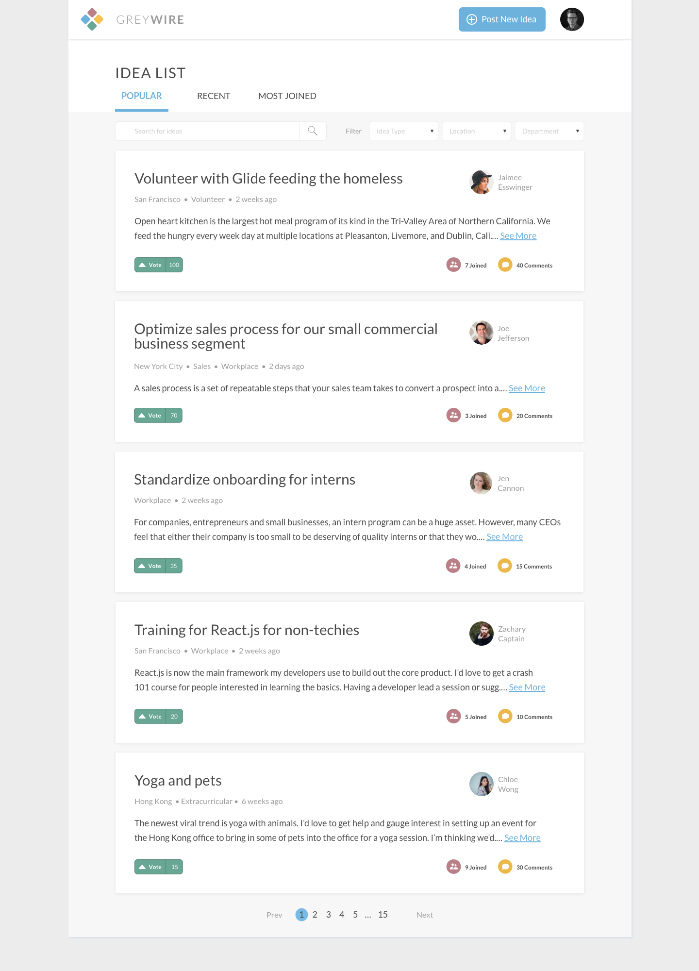
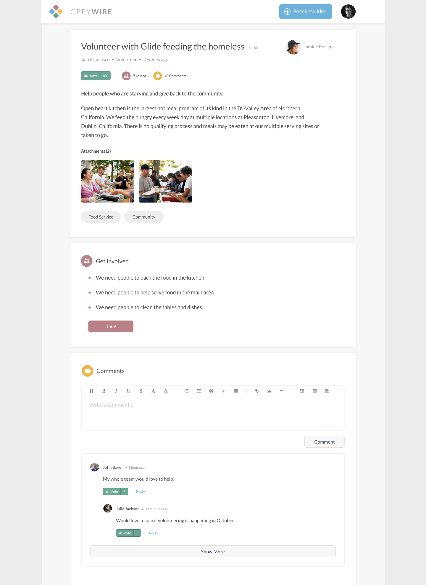
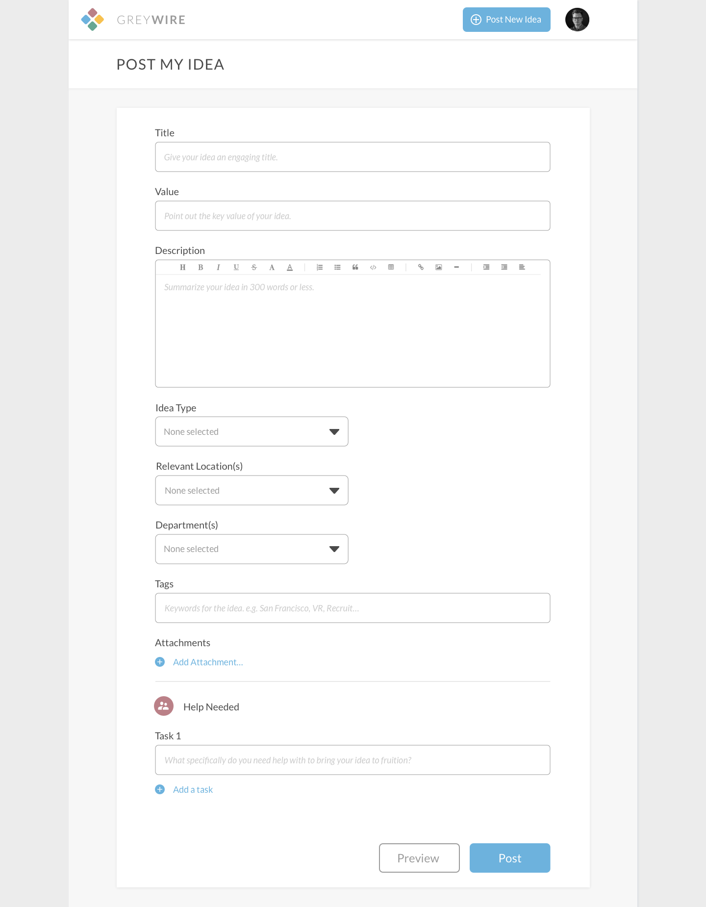
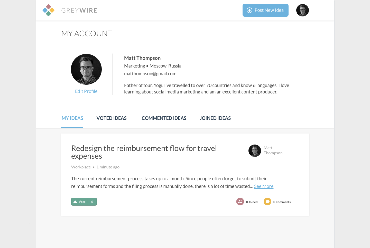
After the research phase, we took an inventory of features we wanted to include based off of our usability testing. We had discussed with the founders about the scope of the project and settled on designing an idea list page, an idea detail page, an idea submission page, and a user profile page. Because we were designing for both web and mobile, we broke up into two groups with each group further dividing to tackle the different pages. I focused on the idea list view and hand sketched some ideas and then quickly made a wireframe in Sketch.
USABILITY TESTING
Based off of feedback from our peers, I made some changes and designed a new version to be used for usability testing. We made a quick prototype combining all the screens to test on subjects who fit our user persona. At this point, we wanted to test if people understood the purpose of the application and expose any confusing features. We tested 9 people and then synthesized all of our results.

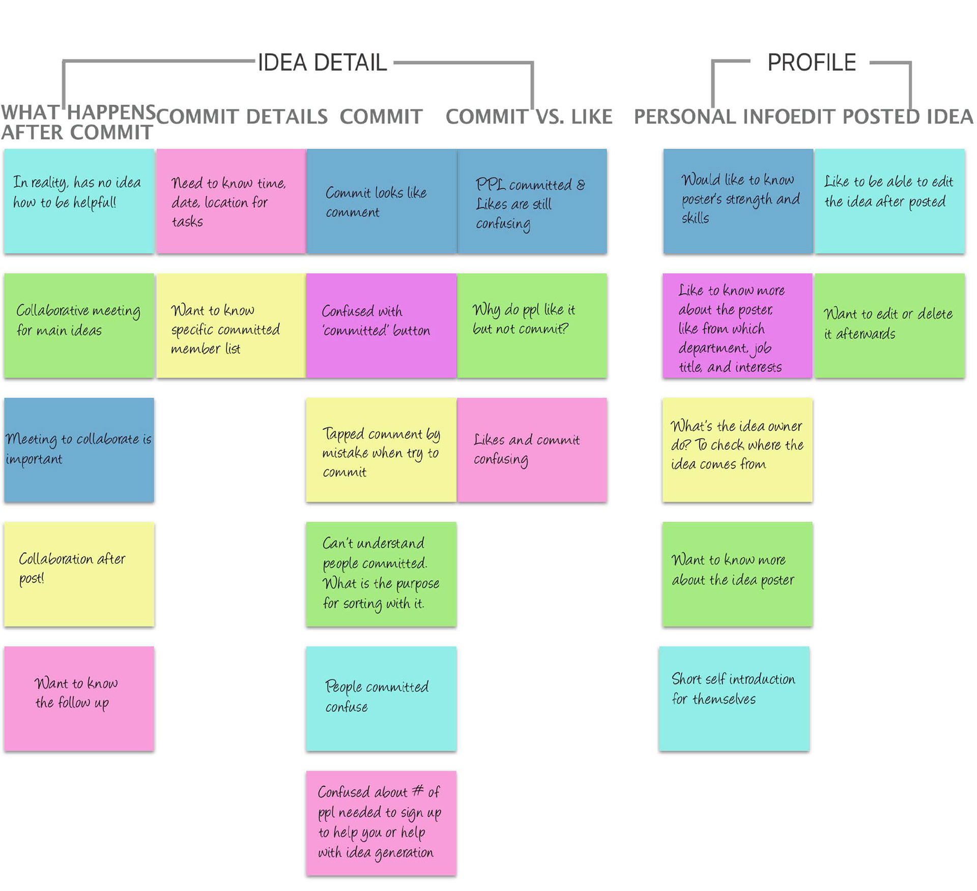
Once again, we took notes of comments the subjects had and pain points they discovered. We identified some common insights that we had to address in future iterations.
• On first impression, users were still unclear about the purpose of the application
• Need for a filter feature
• Commit label/feature is confusing
• Difference between "like" and "commit"
• Users wanted to have more information about the idea owner
• Some ideas would need to be implemented by senior roles
Since some of the pain points were critical to the success of the product, we decided to create another iteration
Hi-Fi Prototyping
Design Principles
Moving into the hi-fi stage, we first wanted to layout a foundation of what guidelines to follow when designing the final screens. We worked with the founders and conducted a brand experience workshop to both help them and us decide on the aesthetics and mood of the final product. We gathered a collection of photos of other products, nature, cool designs, etc. and polled them on which images they liked and felt fit the aesthetic they were looking for for GreyWire. After narrowing down the images, we asked them what adjectives first came to mind upon viewing them and what they liked about each one. At the end, we took note of any overlapping adjectives and key words and synthesized them into some general design principles.
Here were some of the key words:
Professional, Customer-focused, Collaborative, Ownership, Soothing, Innovative but not pretentious
We would keep these words in mind during the rest of our design process.
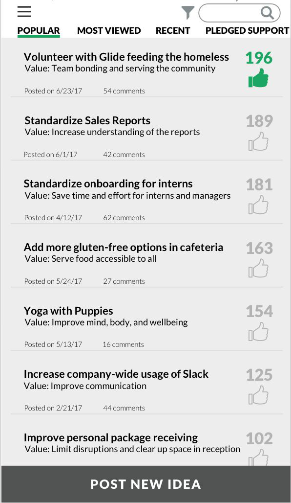
1st iteration and Usability Testing
Having designed the general layout of each screen, we made a quick style guide of the colors, fonts and font sizes, margins and spacing for both web and mobile that we could refer back to in order to maintain consistency, since we were each working on separate screens. We made our first iteration of the hi-fi screens for web and mobile and received critique from our peers. We took the initial critique and quickly developed a 2nd iteration that we could use for usability testing.
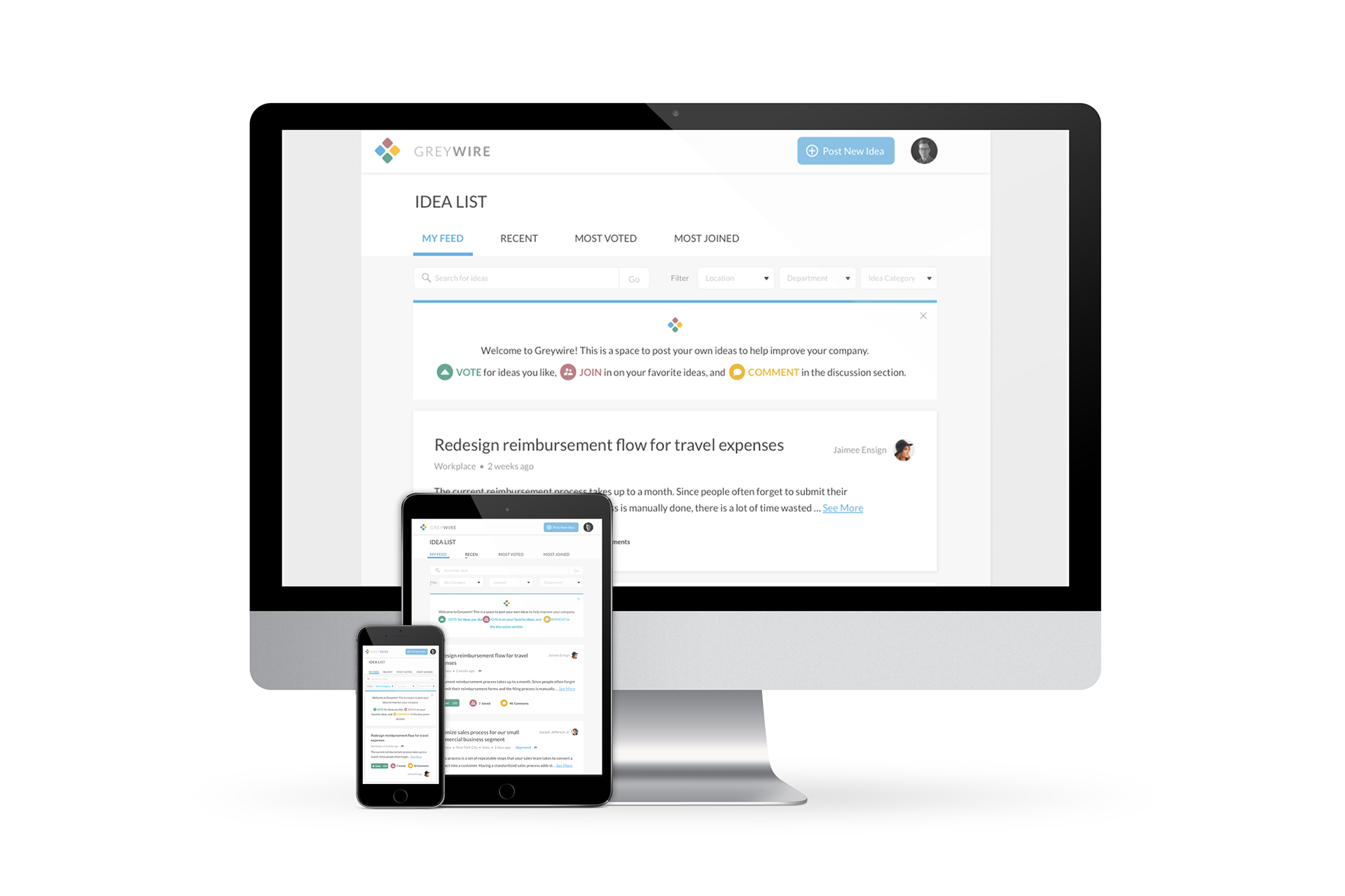
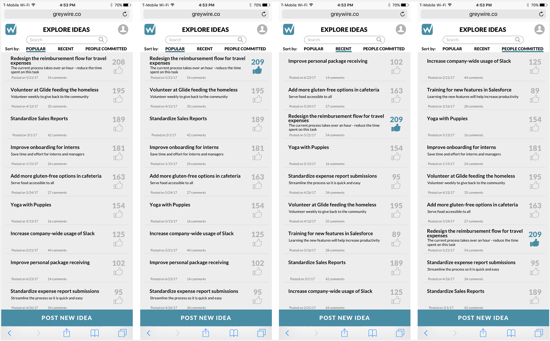
Final Results
Web
Mobile

